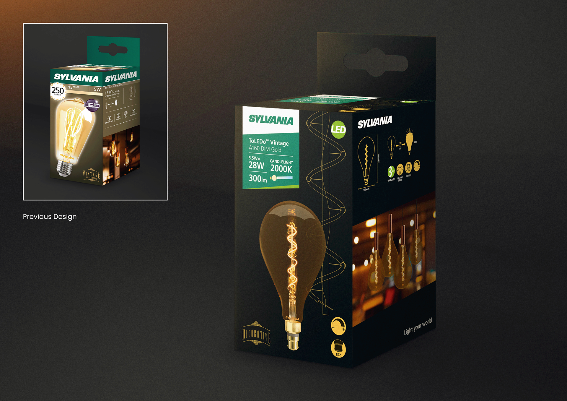
SYLVANIA - PACKAGING BRAND REFRESH
Sylvania underwent an internal and digital brand refresh that needed to be consistently aligned across all packaging. However, inconsistencies in design layouts, typography, iconography, and incorrect brand colours from external studios and printers presented multiple challenges. Additional factors such as packaging durability and unclear standout information further impacted consumer usability and overall brand perception.
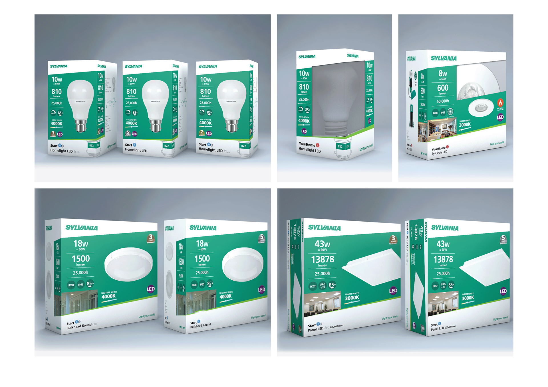
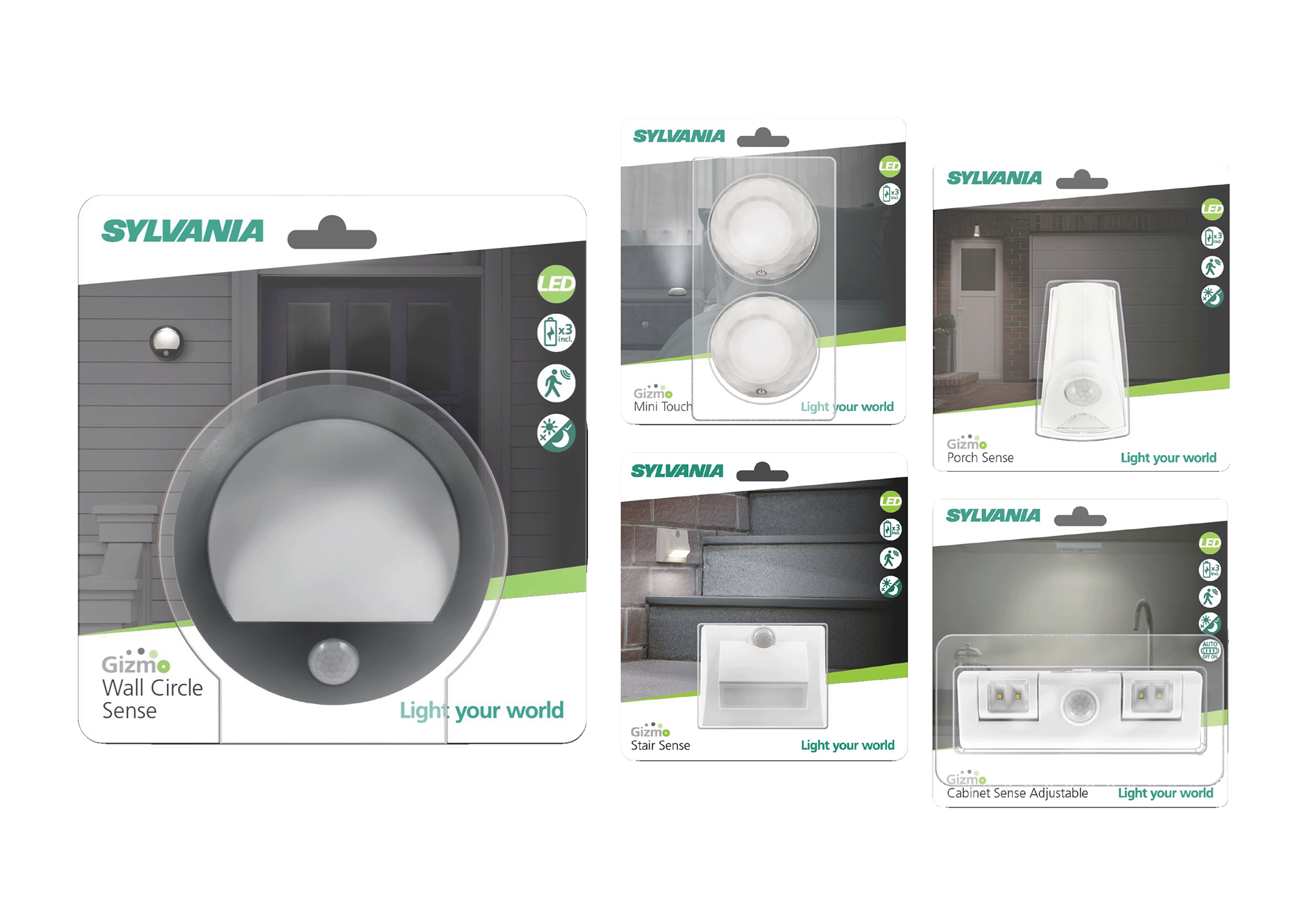
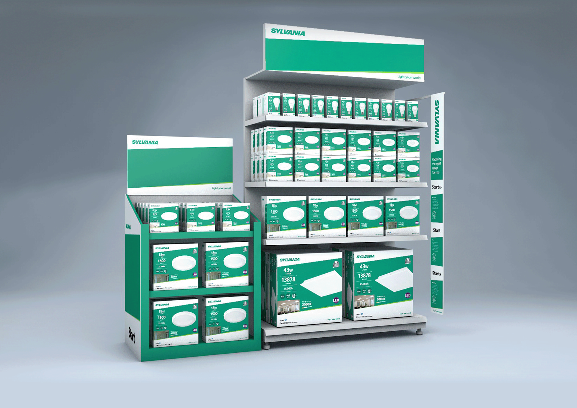
To resolve these issues, a comprehensive design review was conducted, leading to concept solutions that ensured consistency, clarity, and alignment across all packaging touchpoints.
• Packaging design review and refinement
• Brand colour and typography standardisation
• Improved iconography for clarity and consistency
• Packaging durability and usability enhancements
• Brand colour and typography standardisation
• Improved iconography for clarity and consistency
• Packaging durability and usability enhancements